Reimagining Persistence One
Duration
Feb–Mar 2024
Services
Website redesign
Role
Product Designer, Brand & UX
Team
Product Lead, Design Lead
Persistence One had expanded beyond staking and liquid staking to include restaking, but its website hadn’t kept pace. I worked on refreshing the website’s visual language and structure, bringing restaking into focus while creating a more modular foundation for the ecosystem’s growth.

THE CHALLENGE
The ecosystem had evolved. The website hadn’t.
Persistence One had expanded its staking-based products to include restaking, but its website still reflected an earlier stage of the ecosystem. The existing visual language was distinctive, but dense layouts, glowing effects, and abstract compositions made information harder to scan. The reliance on one-off elements also made the experience difficult to extend as new products and content were introduced.
The challenge was to evolve the brand without losing its recognizable identity, while making the website clearer, more structured, and better suited to the ecosystem’s expanding scope.
Before
Previous Visual Language

After
Refreshed Visual System

DESIGN APPROACH
I explored different grid systems and layouts, refined the colour palette and typography, and developed custom isometric illustrations.
The direction moved toward a lighter, more modular experience that could support Persistence One’s expanding ecosystem.
I also considered the practical constraints of handoff, prioritising native layouts and reusable elements.
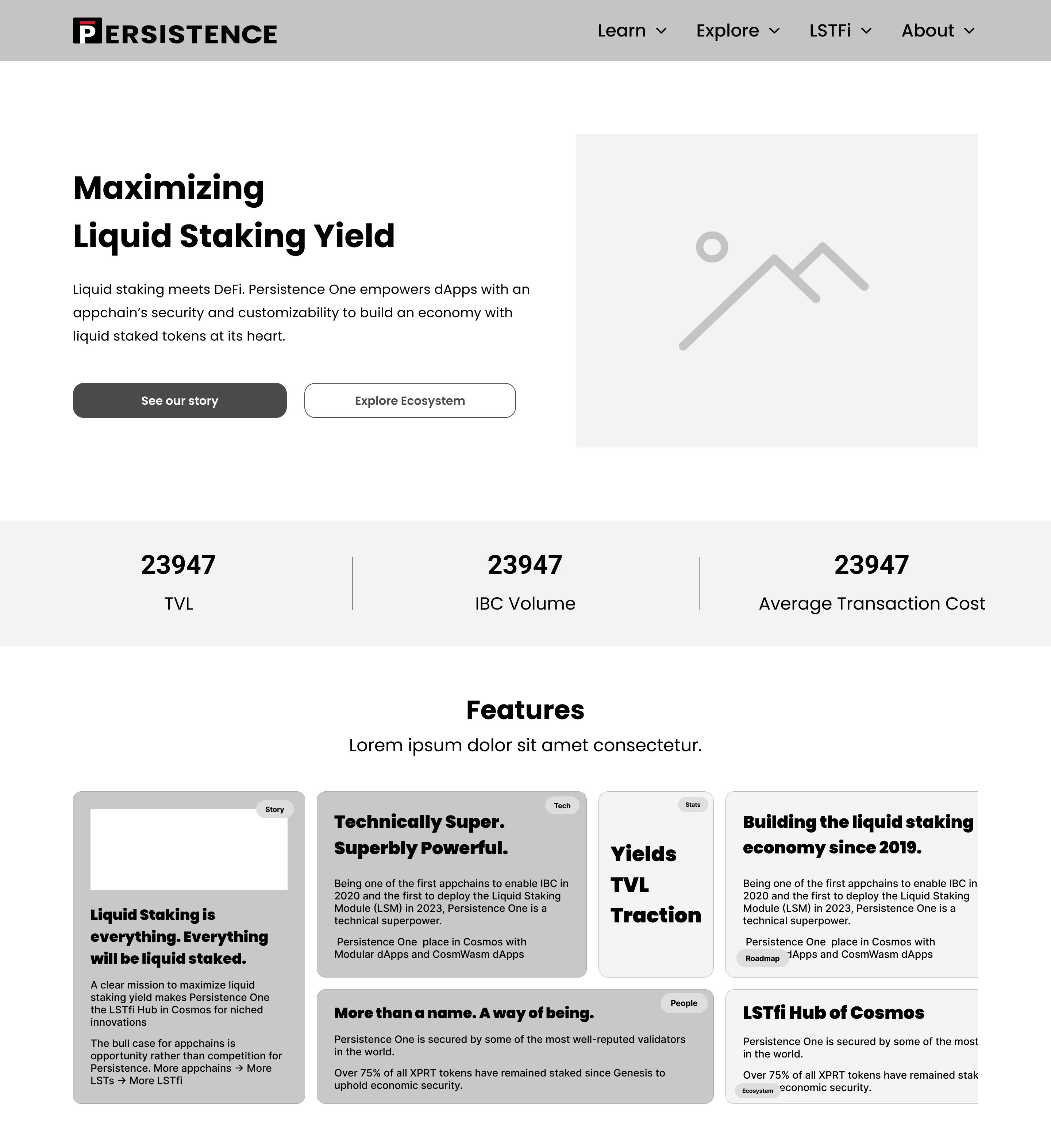
DESIGN EXPLORATION
I explored how the existing Persistence One identity could evolve into a clearer, more flexible visual system. The exploration focused on layout, colour, typography, and custom isometric illustrations. The aim was to retain recognizable brand elements while creating a lighter, more modular foundation for the ecosystem.

FINAL DESIGN
The refreshed website brought staking, liquid staking, and restaking into a clearer, more modular structure.
A lighter visual direction, refined typography, and custom isometric illustrations created a more flexible foundation for the ecosystem as new products and content were introduced.

IMPACT & LEARNINGS
The refreshed visual direction aligned the website with Persistence One's expanding ecosystem, creating a clearer and more modular foundation for new products and content.
This project reinforced the importance of treating visual design as a system when communicating an ecosystem with multiple product lines. With more time, I would have brought user testing earlier into the process and explored motion as part of the visual language.

